Category: Brand Elements
Marshfield Clinic Brand Elements and Logo Use
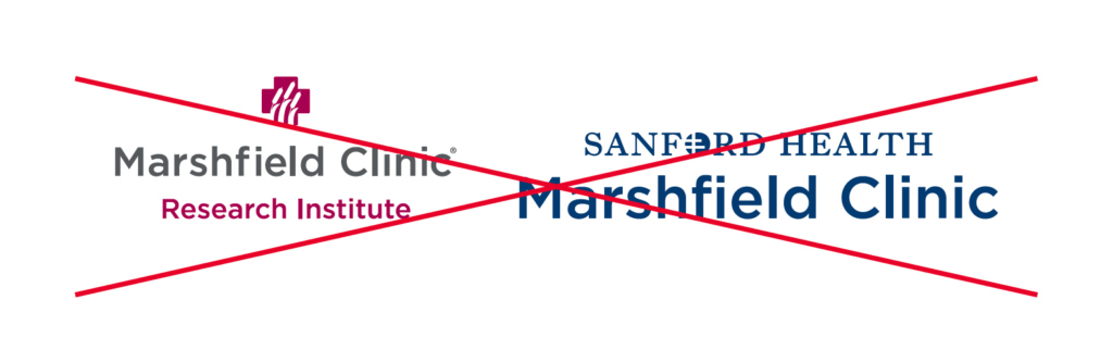
Marshfield Clinic
In-copy references to the brand name should not include “Sanford,” “Sanford Health” or “Health System.” Also see references in copy.
- Examples:
- Marshfield Clinic is improving…
- Here at Marshfield Clinic, our…
MARSHFIELD REGION
The region should be referred to as “Marshfield region.”
Sanford Health Brand Colors: Primary
541 Blue

Pantone 541 C
CMYK
C: 100 M: 45 Y: 5 K: 56
RGB
R: 0 G: 59 B: 113
HEX
#003C71
284 Blue

Pantone 284 C
CMYK
C: 50 M: 12 Y: 0 K: 0
RGB
R: 107 G: 171 B: 229
HEX
#6CACE4
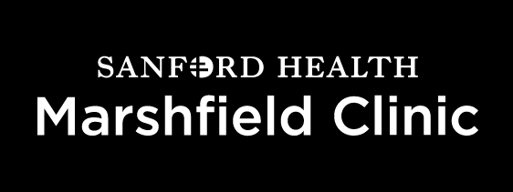
Marshfield Clinic – Primary Logo
Contact your Marketing representative to acquire a print-ready logo.


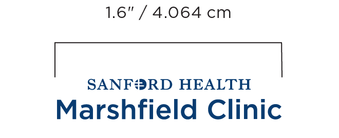
Clear space
The logo should not be crowded or overwhelmed by other elements. “Clear space” refers to the area surrounding the logo that should be kept free of visual distraction. No graphic elements or text of any kind should be placed within this clear space area, X=M.
Minimum size
Unauthorized use
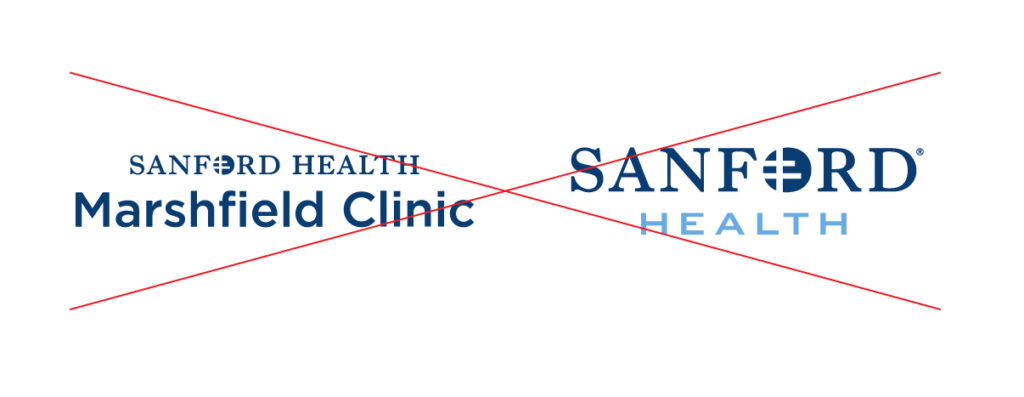
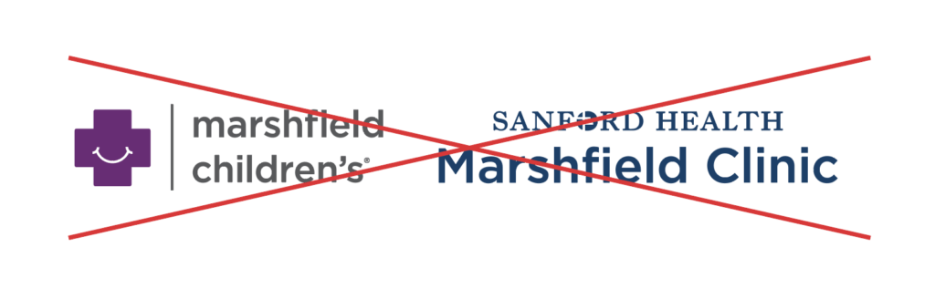
Co-branding
The Marshfield Clinic logo may not be combined with any other logo within our organization.
Fonts – See Typography
Good Samaritan Micro Brand Guide
This is an abridged version that contains content from the Good Samaritan brand element and writing style guides.
General, Brief Description
Good Samaritan is an affiliate of Sanford Health and provides long-term care, home health, hospice, rehab therapy and independent living.
Good Samaritan Name usage
The Evangelical Lutheran Good Samaritan Foundation
- Capitalize “The” when using the full name
- “the Good Samaritan Foundation” is acceptable when the full legal name isn’t needed (note that “the” isn’t capitalized when this term is used)
- “the Foundation” is acceptable on second reference
The Evangelical Lutheran Good Samaritan Society
See also “Good Samaritan“
Do not capitalize “the” when using the shortened name (Good Samaritan) unless it begins a sentence. But when writing the full, formal name (The Evangelical Lutheran Good Samaritan Society), always capitalize “The.”
- Employees at The Evangelical Lutheran Good Samaritan Society are happy to talk to residents.
- Employees at Good Samaritan are happy to talk to residents.
- Good Samaritan has locations in 24 states
◼︎ Do not write the name of the organization as Good Samaritan Sanford Health, Good Samaritan Society, Good Sam, GSS or GSSH.
Good Samaritan
See also “The Evangelical Lutheran Good Samaritan Society“
When writing the full, formal name (The Evangelical Lutheran Good Samaritan Society), always capitalize “The.”
- Employees at The Evangelical Lutheran Good Samaritan Society are happy to talk to residents.
- Employees Good Samaritan are happy to talk to residents.
- Good Samaritan has locations in 24 states.
◼︎ Do not write the name of the organization as Good Samaritan Sanford Health, Good Samaritan Society, Good Sam, GSS or GSSH.
Good Samaritan data (as of August 2019)
- the largest not-for-profit provider of senior housing and services
- more than 380 locations
- 24 states
- more than 19,000 employees
- more than 30,000 people served daily
Good Samaritan DBA (“doing business as”) names
Use an en dash (–) (alt+hyphen) with a full space on either side (“Good Samaritan – Millard”). For materials that can be designed in InDesign or website coding that allows it, use thin spaces (command+option+shift+space) instead of full spaces around the en dash.
Note: Not all location DBAs begin with “Good Samaritan – .” Some locations are joint ventures or managed locations. Refer to the directory for more information on a location’s DBA name.
Also see Good Samaritan and The Evangelical Lutheran Good Samaritan Society entries.
See “Good Samaritan data.”
number of Good Samaritan employees
See “Good Samaritan data.”
number of people served by Good Samaritan every day
See “Good Samaritan data.”
Good Samaritan Brand Elements and Logo
Good Samaritan Brand Colors: Primary
The primary Good Samaritan color palette consists of the Deep Blue and Light Blue colors. The consistent use of these colors will create recognition and strengthen our identity.
541 Blue
Pantone 541 C
CMYK
C: 100 M: 45 Y: 5 K: 56
RGB
R: 0 G: 59 B: 113
HEX
#003C71
284 Blue
Pantone 284 C
CMYK
C: 50 M: 12 Y: 0 K: 0
RGB
R: 107 G: 171 B: 229
HEX
#6CACE4
Good Samaritan Brand Colors: Accent

Pantone 130 C
CMYK
C: 2 M: 38 Y: 100 K: 0
RGB
R: 245 G: 168 B: 0
HEX
#F5A800
Good Samaritan – Primary Logo
Contact your Marketing representative to acquire a print-ready logo.


Clear space
The logo should not be crowded or overwhelmed by other elements. “Clear space” refers to the area surrounding the logo that should be kept free of visual distraction. No graphic elements or text of any kind should be placed within this clear space area, X=G.
Unauthorized use

Fonts – See Typography
Co-branding
Co‑branding is not used within our family of brands.
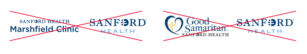
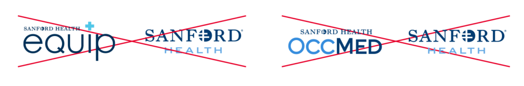

A co-branded logo represents a partnership between merged brands. So, when two logos are used in tandem but not meant to be co-branded, they may be mistaken for a single co-branded logo.
Co‑branding may be permitted in limited situations and must be approved by Creative Services.
When co-brands contain multiple Sanford Health entities, the primary presenter’s brand should take precedence. If there is uncertainty, it is typically best to default to the parent brand.
Contact Creative Services for questions or more information.
The Sanford Foundation
The Sanford Health Foundation operates under its own established brand standards, which may include co‑branding in specific circumstances. These standards are set and managed by the Foundation’s marketing team.
For guidance related to Foundation materials, please contact the Foundation marketing team directly.
Edith Sanford Breast Center
Edith Sanford Breast Center Brand Color: Accent
The Edith Sanford Breast Center accent color complements the Sanford Health primary colors. This color should be used as an accent color only, not a primary color.
226 Pink
Pantone 226 C
CMYK
C: 0 M: 100 Y: 2 K: 0
RGB
R: 208 G: 0 B: 111
HEX
#D0006F
Sanford Health Brand Texture: Primary
The upward movement of the texture represents the visionary thinking and aspirations of the Sanford Health organization.
Sanford Health Brand: Gradient
The Edith Sanford Breast Center gradient palette can be blended with the primary colors. When using the gradient, make sure to select “Multiply” in the Effects palette and use the Gradient Build settings below.

Gradient Build

Sanford Edith Sanford Breast Center Wordmark
The Sanford Edith Sanford Breast Center mark is made up of two components: the Sanford wordmark and the Edith descriptor. These two components are always placed in a fixed vertical relationship and should never be altered, modified or recreated in any way.
Contact your Marketing representative to acquire a print-ready wordmark.


Tyto Care
Restricted Content
This content is restricted to Authorized Users only.Login / Register
If you are a member of the Sanford Health or Good Samaritan Marketing staff, contact Kathleen Rowland at kathleen.rowland@sanfordhealth.org for registration instructions.
Good Samaritan Brand Elements and Logo Use
General, Brief Description
Good Samaritan is an affiliate of Sanford Health and provides long-term care, home health, hospice, rehab therapy and independent living.
Good Samaritan Name Usage
Good Samaritan is the name that should be used on all references to the full organization. There is no change for any subsequent reference.
While The Evangelical Lutheran Good Samaritan Society remains the organization’s official full name, we advise against using it in writing unless required for legal or compliance reasons.
◼︎ Do not write the name of the organization as Good Samaritan Sanford Health, Good Samaritan Society, Good Sam, GSS or GSSH.
Brand Colors: Primary
The primary Good Samaritan color palette consists of the Deep Blue and Light Blue colors. The consistent use of these colors will create recognition and strengthen our identity.
541 Blue
Pantone 541 C
CMYK
C: 100 M: 45 Y: 5 K: 56
RGB
R: 0 G: 59 B: 113
HEX
#003C71
284 Blue
Pantone 284 C
CMYK
C: 50 M: 12 Y: 0 K: 0
RGB
R: 107 G: 171 B: 229
HEX
#6CACE4
Brand Color: Accent
The secondary Good Samaritan color palette includes one color used to complement the primary colors.
Brand: Gradient
The Good Samaritan gradient palette can be blended with the primary colors. When using the gradient, make sure to select “Multiply” in the Effects palette and use the Gradient Build settings below.
Gradient Build

Pantone 130 C
CMYK
C: 2 M: 38 Y: 100 K: 0
RGB
R: 245 G: 168 B: 0
HEX
#F5A800
Good Samaritan – Primary Logo
Contact your Marketing representative to acquire a print-ready logo.
Clear space
The logo should not be crowded or overwhelmed by other elements. “Clear space” refers to the area surrounding the logo that should be kept free of visual distraction. No graphic elements or text of any kind should be placed within this clear space area, X=G.
Unauthorized use
Fonts – See Typography
Sanford Health Plan / Align powered by Sanford Health Plan
Sanford Health Plan
Brand Color: Accent
The Health Plan accent color complements the Sanford Health primary colors. This color should be used as an accent color only, not a primary color.
314 Teal
Pantone 314 C
CMYK
C: 100 M: 5 Y: 14 K: 17
RGB
R: 0 G: 127 B: 163
HEX
#007FA3
Brand Elements
The Health Plan element is a polygon shape that can be used in a variety of ways including, but not limited to, a header marker, an image holder, a call-out box and page accents.

Brand: Gradient
The Sanford Health Plan gradient palette can be blended with the Primary Colors, 541 Blue and 314 Teal. When using the gradient, make sure to select “Normal” in the Effects palette and use the Gradient Build settings below.

Gradient Build

Sanford Health Plan Wordmark
The Sanford Health Plan mark is made up of two components: the Sanford wordmark and the Health Plan descriptor. These two components are always placed in a fixed vertical relationship and should never be altered, modified or recreated in any way.
Contact your marketing representative to acquire a print-ready wordmark.


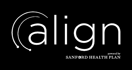
Align powered by Sanford Health Plan
Legal name usage
The name “Align powered by Sanford Health Plan” must not be shortened to “Align.” “Align” is a trademark of a different entity. Always use the full, trademarked name.”
Even though “Align” is lowercase in the wordmark, capitalize it in body copy. Lowercase “powered by.”
Align powered by Sanford Health Plan Wordmark
Contact your marketing representative to acquire a print-ready wordmark.


Sanford Cancer Center
Cancer Brand Color: Accent
The Cancer Center accent color complements the Sanford Health primary colors. This color should be used as an accent color only, not a primary color.
2593 Purple
Pantone 2593 C
CMYK
C: 66 M: 92 Y: 0 K: 0
RGB
R: 132 G: 50 B: 155
HEX
#84329B
Sanford Health Brand: Gradient
The Cancer Center gradient palette can be blended with the primary colors. When using the gradient, make sure to select “Multiply” in the Effects palette and use the Gradient Build settings below.
Gradient Build
Sanford Cancer Center Wordmark
The Sanford Cancer Center mark is made up of two components: the Sanford wordmark and the Cancer Center descriptor. These two components are always placed in a fixed vertical relationship and should never be altered, modified or recreated in any way.
Contact your Marketing representative to acquire a print-ready wordmark.


Sanford Orthopedics & Sports Medicine
Orthopedics & Sports Medicine Brand Color: Accent
The Orthopedics & Sports Medicine accent color complements the Sanford Health primary colors. This color should be used as an accent color only, not a primary color.
428 GRAY
Pantone 428 C
CMYK
C: 10 M: 4 Y: 4 K: 14
RGB
R: 193 G: 198 B: 200
HEX
#C1C6C8
Sanford Health Brand: Gradient
The Orthopedics & Sports Medicine gradient palette can be blended with the primary colors. When using the gradient, make sure to select “Multiply” in the Effects palette and use the Gradient Build settings below.
Gradient Build
Sanford Orthopedics & Sports Medicine Wordmark
The Sanford Orthopedics & Sports Medicine mark is made up of two components: the Sanford wordmark and the Orthopedics & Sports Medicine descriptor. These two components are always placed in a fixed vertical relationship and should never be altered, modified or recreated in any way.
Contact your Marketing representative to acquire a print-ready wordmark.


Sanford Heart
Heart Brand Color: Accent
The Heart accent color complements the Sanford Health primary colors. This color should be used as an accent color only, not a primary color.
485 Red
Pantone 485 C
CMYK
C: 0 M: 95 Y: 100 K: 0
RGB
R: 218 G: 41 B: 28
HEX
#DA211C
Sanford Heath Brand: Gradient
The Heart gradient palette can be blended with the primary colors. When using the gradient, make sure to select “Multiply” in the Effects palette and use the Gradient Build settings below.
Gradient Build
Sanford Heart Wordmark
The Sanford Heart mark is made up of two components: the Sanford wordmark and the Heart descriptor. These two components are always placed in a fixed vertical relationship and should never be altered, modified or recreated in any way.
Contact your Marketing representative to acquire a print-ready wordmark.


